Slideshare, a quick analysis about revenue optimization
First, I do not pretend to hold the absolute truth. This article is only a personal reflexion about Slideshare, using some of my knowledge in Webmarketing and Psychology of Influence.
As always in webmarketing, the best way to know what is the more efficient is to split-test the ideas one by one, and see if it has a positive or negative impact on conversion or click rates.
Slideshare has an hybrid business model. Their revenue comes from advertising (mostly Google Adsense I guess), but also from premium accounts as they implemented a freemium model in 2010.
My analysis will go through the two sources of revenue, and I'll try to bring some ideas to optimize all that !
Revenue from Advertising
Increasing revenue from advertising could be achieved by improving their :
- Targeting : having advertising relevant for the user
- Visibility : putting the advertising in eye-catching places
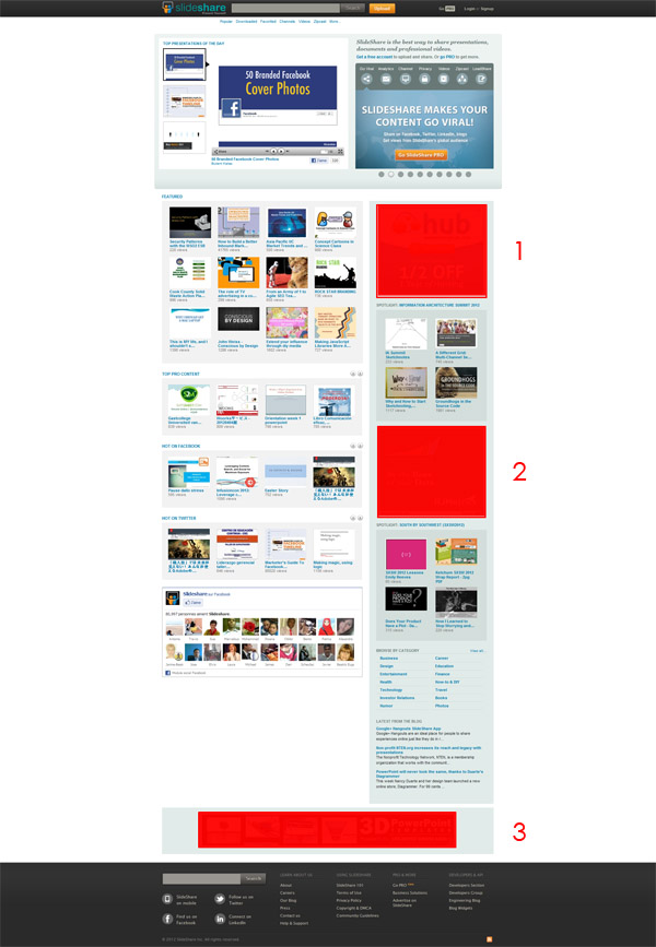
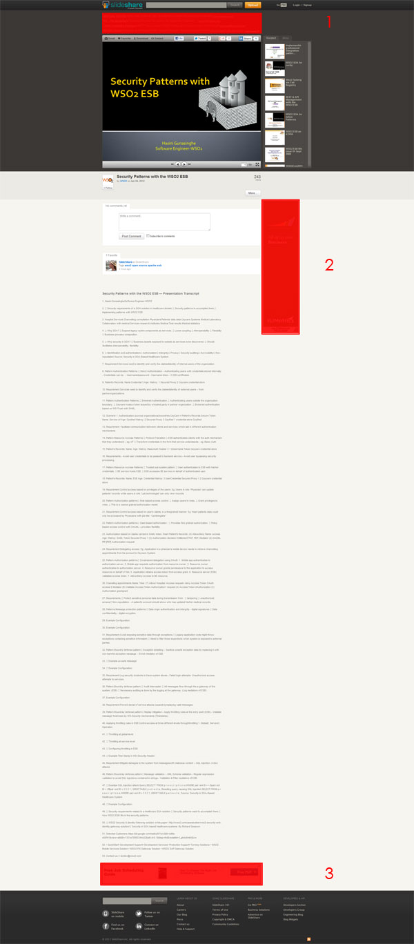
As Slideshare mostly uses Google Adsense, it is already well-targeted, and that's why I will focus on visibility. Here are screenshots of the homepage and the page that displays the presentations uploaded by users (there are also advertisement on the profile pages, but I will not mention them) :

On the homepage, the advertisements #1 and #2 are on the right of the page, mixed with content. The #3 is at the bottom of the page. These positions are probably non-optimal. I am not really sure people look at the right column or scroll to the bottom !

On the presentation page, the advertisement #1 is on the top of the page and is a textual content. The spot is good, but the texual ad is not really visible in my opinion. The #2 is on the right and follows the user when he scrolls down. Good job it is really eye-catching ! The #3 is at the bottom just before the footer, and I guess no one will scroll down to this one as the main content is the presentation, and not the transcript.
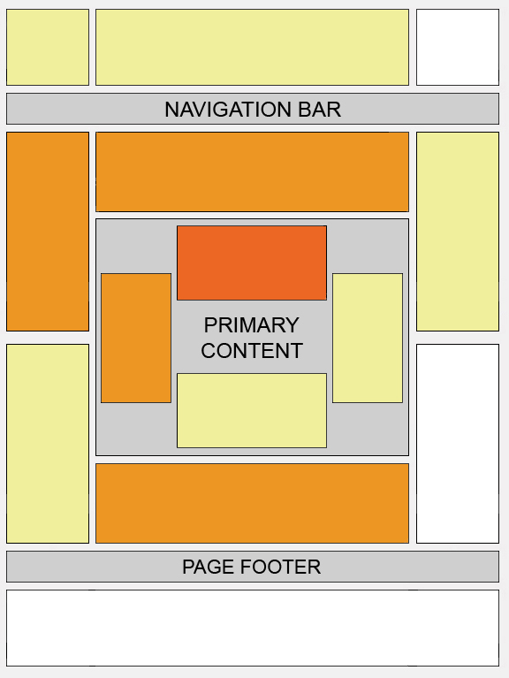
To support my analysis, here is a heat map of the best locations for placing advertising according to Google :

As a general rule,best places are on the top-left of the page, and the closest possible to primary content. Placing advertising only in strategic locations could increase the clic rate, and maybe even allowing a reduction of the number of ads.
Aside Google Adsense banners, Slideshares offers only 3 formats of ads (728×90, 300×250, 468×60) whereas video-sharing plateform such as Youtube or Dailymotion have a wider range of posibilities. It could be interesting to diversify the offer with advertisment before or after the presentations, custom branded hompage, sponsored presentations on the homepage, …
Revenue from Premium accounts
If we divide the strategy in two step, they could be :
- Focus : attracting the user to the selling page
- Convert : having an irresistible offer
1. Focus
Currenlty, here are the different possibilities to reach the selling page :
- The GoPRO button on the top of the page. Maybe a more explicit and eye-catching color would be better ?
- The slideshow on the home page. I am not sure it is really efficient due to the right position and the overloaded text. Why not a full width slider, or just having a full-width « headband » below the hear that appears sometimes, delayed few seconds after the page is loaded, and with a catchy sentence such as « Click here to learn how to market your business on Slideshare ».
- The Upload+ button when you upload a presentation.
- The opening pop-up when you try to close ads. I really like this type of incentive that show the user the limits of the free version. We see them all the time in websites such as Viadeo or LinkedIn. It is annoying for the user, but powerful.
- From e-mails (e.g. when you reach 100 views, you even get a coupon code) : excellent !! 😀

A selling page is like the city of Rome. All roads must lead to it !
2. Convert
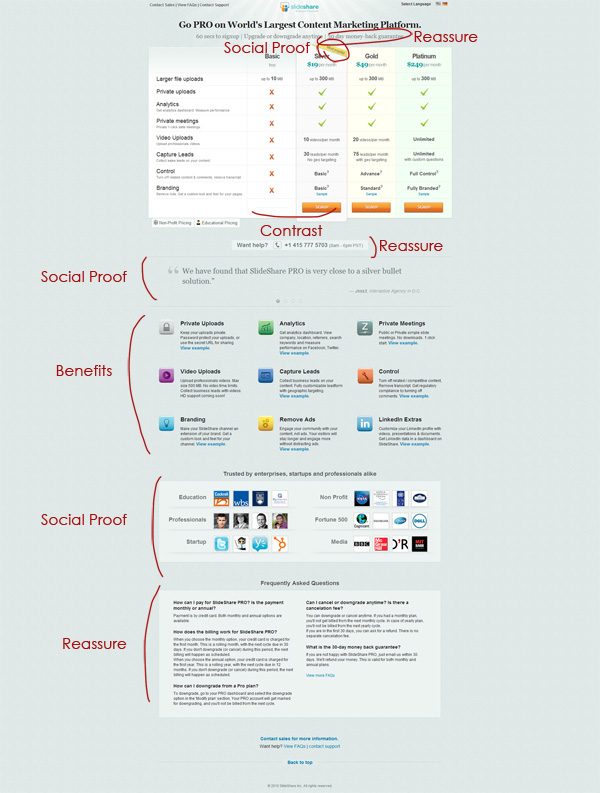
The selling page is quite good and uses some concept of influence to refute some common objection an user may have :
- Social Proof : if the NASA uses Slideshare Pro that must be a good product. If the Silver plan is the most popular it should be the best one.
- Contrast : Comparing to the premium versions, it looks like you can't do anything with the Basic plan. Comparing to the Gold or Platinium plan, the Silver one seems affordable and you have nearly the same benefits!
- Reassure : In case the user is not convinced, he can read the FAQ and call for assistance. And even if he is not satisfied he has a 30-day moneyback guarantee.

Even if the page is good, here are some ideas to improve it :
- Video : Yes, a video is powerful I think.
- Social Proof (again) : Show more testimonials, with the faces of customers to humanize the page, and write something like « We have already XXX happy customers ! »
- Foot-in-the-door : Ask first a small request that everyone will accept, and then a larger one. (I have no specific idea of application in mind)
- Reciprocity : Give them something for free to make them feel they have a debt. (I mean something more than Slideshare free plan, which is difficult to implement)
- Emailing : Email users that visited the selling page. If they don't sign up, email them a second time with a special discount.
- Urgency : Make discounts valid only for 48 hours. (the 100 views' coupon code is valid 2 weeks)
As a conclusion, the purpose of this article was to give some ideas to make Slideshare more profitable without turning upsde down the business model.
Maybe I am totally wrong, and previous A/B tests showed this configuration of Slideshare is actually the best one.
I would really like to know if this analysis is relevant, so feel free to criticize and leave your comments.
I would be even more pleased to read a comment from you Rashmi 😀